Showing posts with label holidays. Show all posts

Sunday, June 14, 2015

Flag Day


7" x 7", Prismacolor colored pencils 
on Canson Mi-Teintes pastel paper, Light Blue
(click to enlarge)

It's Flag Day today, so I'm re-posting this piece from last summer.  When I was growing up, everyone put their flags out on Flag Day but it doesn't seem to be widely celebrated today. I hang my flag out from Memorial Day until Labor Day—it just looks like Summer to me. 

(You can read last summer's post about this piece here.)

Tuesday, March 3, 2015

The simple joy of dyeing eggs

6" x 6" on 8" x 8" paper
watercolor and water-soluble printer's ink on Arches 88 paper
click to enlarge


Chicks and rabbits, daffodils and tulips, jelly beans and marshmallow peeps—I adore Easter-y things. But my favorite Easter tradition of all is dyeing eggs. Over the years, our family has experimented with just about every known way to color and decorate eggs. Store-bought kits, natural dyes, tie-dyeing, markers...I even bought this kit ages ago but was never quite industrious enough to tackle those detailed Ukrainian designs.


I may feel brave and try it out this year, but really and truly, the method I love best is the classic: Drop that little Paas color tablet into a cup of water (not those fizzy tablets, I like the ones that require hot water and vinegar) or better yet, get out the food coloring and mix up some colors of your own. I always have either the malted milk "robin's eggs" or Cadbury caramel eggs close at hand. Dyeing eggs requires sustenance.

With this little linocut image, I was trying to convey the simple joy of taking that plain egg and choosing which color to use first. I was going to cut separate blocks for the dye cups, but decided to paint them in with watercolor before pulling the print. That way, I could play with different colors, etc. (I use water-soluble printer's ink, so I couldn't do the watercolor after the printing.) I'm still learning about printing and watercolors, so there was a lot of experimentation!

Here's the uncolored print:


and here's one printed on Stonehenge Kraft and hand-colored with colored pencils:


Finally, I scanned one and made smaller digital prints for some cards. 
I just love my printer (Epson Artisan 1430), it's hard to tell the digital prints from the hand-pulled ones!


Tuesday, January 20, 2015

A Box of Chocolates

(click to enlarge)

Well, I still can't get enough of linocut printing. This latest piece that I did for Valentine's Day is another reduction print, meaning that first you carve away the areas that you want to stay the paper color. After that first color is printed (the "milk chocolate" color in this piece) you carve away the areas that you want to remain the color that you just printed, and so on. Some artists even do reduction prints of twenty or more colors! One of my favorites is Sherrie York. Her website and blog show the steps in her process so beautifully. Amazing. Ok, back to my little print...


After printing the milk chocolate and dark chocolate, I "cheated" and made a separate little block for the red heart. I was going to put a border around the image, but after playing around with it, I decided that I like it as is.


I ended up with about ten prints that turned out with varying degrees of success including the one at the top of the post, from which I've made slightly larger digital prints for my Etsy shop. I love how they turned out: I can hardly tell the difference between the original block print and the reproductions!


So, along with this Christmas one, there are now two "A Box of..."

What should be next?


Monday, September 30, 2013

I love candy corn

3" x 3", Prismacolor colored pencil


Happy October! As a seasonal addition to my series of "botanical hearts", I give you the iconic candy of autumn in America—candy corn!

I love candy corn. I know, it's full of junky ingredients (mostly sugar) and I did find it humorous that this year's packages boast "Made with Real Honey" just above where it says "artificial flavors". But it's just so cute and nostalgic. It has certainly earned its iconic status—it was created in the 1880s by George Renninger of the Philadelphia-based Wunderle Candy Company. While I was researching that historical tidbit, I also learned that The National Confectioners Association estimates that 20 million pounds—just over 9,000 metric tons—of candy corn are sold annually. (I certainly did my part and consumed a bit while doing this little drawing.)

Just for fun, I thought I'd show you what my drawing board looks like when I'm testing colors, even for a simple little piece like this:


And here's another little WIP shot:


Happy October!

Note: If you'd like to see the other pieces in my Botanical Hearts series, the most recent one here has a link down toward the bottom of the post. One of these days I'll group them all together for easier viewing! 

Monday, December 3, 2012

Anniversaries and anticipation


My little blog is two years old today!  
(Well, technically, it was two years old on Saturday, 
but a few sick days last week threw me off a bit.)


It's a happy accident that my blogging anniversary is December 1, as it's one of my favorite days of the year. You see, I have a passion for advent calendars. Childhood memories of the anticipation of Christmas surely fuel my obsession.  But there's something about finding each little numbered paper door and revealing its surprise underneath that still excites me. Like anyone who's a little obsessive/compulsive about something, I have a few rules regarding what constitutes, for me, the perfect advent calendar:

1. It should  be made out of paper. I'm not a huge fan of the fancy wooden ones, or any that get re-used every year. It just seems more special to be used only once, an ephemeral thing, so that each year holds new surprises.

2. It should have little doors or windows to open. That seems like a given, I know. But there are a plethora of clever, craftsy ones in a clothesline or wall-hanging style that use things like little bags or stockings, but they're not for me.. give me a perforated paper door.

3. You should have to hunt for each door just a bit. Another reason to look askance at the ones I mentioned in #2: No hunting = no fun.

4. The doors should be integrated into the image, not just randomly cut into it it. Villages and houses, that have windows and doors that open, are just right. Or anything where you're opening an object to reveal what's underneath...not just a scene with 24 perforated doors cut into it. Which leads me to a related item:

5. The revealed image should relate to the cover image, but change it slightly. You open a window and see the people inside that room doing holiday things, you open the stable gate to see a pony, you move a knot on a tree to reveal a squirrel inside.

6. The backing paper should let light through. While we often hang ours on a wall, or set it on a table, I like them best hung on a window where the sunlight illuminates the openings...another childhood memory.

7. The door for the 24th should be biggest and reveal a special image. None of this stuff where 24 is the same size as 1. Furthermore, there should be no door for the 25th...it's all about the anticipation; on the 25th, you're already there.

So, there you have my preferences, but I'll admit that I also enjoy a few non-conforming ones: I love my little Victoran numbers that  I've shown at the top of the post. I also have a real affinity for the Playmobil advent calendars. We bought them almost every year as my kids grew up. But to me, the best part was that the parent got to prepare and fill it ahead of time, folding up the little paper boxes and  putting each piece of the scene inside. They've recently gone to a pre-filled style that you don't get to assemble yourself, and which shows all of the pieces on the back, which ruins the surprise a bit. But they're always quite charming; the one for this year includes a couple of hedgehogs!)

I'l leave you with a photo of my kitchen wall from a few years ago when I decided to display some of my calendars from years past (I keep them all):


How about you? Are you an advent calendar person? Do you have a favorite?
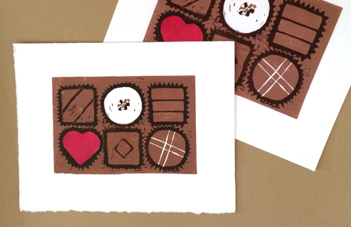
Wednesday, February 22, 2012

Birthdays

Presidents' Day? Bah, humbug. February used to belong to Lincoln and Washington. I grew up knowing that the twelfth is Abe's birthday, and today is George's. But now I guess they have to share the month with the likes of Millard Fillmore.

So, in honor of Washington's birthday, here's another of my vintage postcards that I started sharing with you earlier in the month. This one was sent to my husband's grandfather on February 23, 1910, and reads (uncorrected):

Wright soon (up in the corner)
Dear Friend, I recived your cards but have been real sick since you left your trunck is all right and it is hear when everver you ge ready for it no mail has come for you since you left
James Rider

I am working on a fun birthday-related drawing that I had hoped to post today, but it's not quite finished, and doesn't read well as a work-in-progress piece. It will be up here in the next couple of days!
Happy Birthday, George!

Saturday, February 11, 2012

Illustration Friday: Popularity


I'm interrupting my "botanical hearts" series to bring you this sketch of some hearts of a different sort. These classic little confections enjoy a soaring popularity this time of year. Nothing says "Valentine's Day" quite like conversation hearts.

Oddly enough, they're kind of challenging to draw. I spent a couple of hours on a more "photorealistic" drawing, only to scrap the darn thing. There's something about that type on them that trips me up: it's very imperfectly stamped onto the candies, but that imperfection is hard to duplicate. So I decided to do a quickie drawing, and I think that the more casual sketch sort of suits these little hearts.

Have a wonderful Valentine's Day!