Tuesday, December 23, 2014

Sleigh bells ring...are you listening?


Well, my block printing obsession seems to be here to stay. After spending hours on a detailed pencil drawing, it's so satisfying to pull print after print off of a carved block. This little print is based upon this drawing of a sleigh bell from a few years ago. It was my first time doing a 2-color print that isn't a reduction print, so it was a bit tricky getting things to register.

 I was thinking that I'd do a separate block to print the red ribbon attached to the bell, but I ended up liking the image of the bell by itself. And I really liked stringing them onto festive string...


...and using them as tags on Christmas packages. Hmmm...maybe I'll make more and use them as garland next year!


I also wanted to do an original little composition of traditional red glass ornaments in a box. The possibilities are endless as far as printing options: varying the colors, etc.


It always takes lots of planning to figure out what prints where...!


I really had trouble registering this one; I ended up re-carving one of the blocks...ugh. I believe that I got one that turned out perfectly. But I love it and I think it will inspire a series of things in boxes...we'll have to see! In the meantime, happy, happy holidays from my house to yours.

Thursday, December 18, 2014

A few of my favorite things: Acorns!


Prismacolor colored pencil on Stonehenge paper

As kids, we'd collect acorns in our yard and pretend we were making acorn soup, or we'd use the caps as whistles. Our acorns in the Midwest were the more rounded shape, but here in Northern California, these more elongated, pointy ones from the live oak are the norm. On one of our morning walks, my friend and I gathered a handful for a possible drawing. (Thank goodness they were in a plastic bag on my desk because they started to yield little piles of "sand"—they were inhabited!) It was hard to choose my final "models" with such a beautiful range of sizes and colors, but these caught my eye and looked like they belonged together.

The natural world provides an endless source of decorative images, but I have some definite favorites. One is the pinecone, another is the bee, (Click on those words in the labels on the right to see related posts.) but I'm crazy about acorns. Let's see—I have these felted acorns with their real acorn caps (bought at the fabulous Renegade Craft Fair in San Francisco),


this card of adorable pewter acorn buttons hangs on my bulletin board, 


and I just purchased this nativity set from Simple Gifts Toys on Etsy!


Just in case this is my last post before Christmas, 
I, along with my acorn-capped wise men, wish you the very happiest of holidays!

Monday, December 1, 2014

Happy Anniversary, Blog!


Four years ago today, I posted this drawing and wrote my first blog post!

I love the first day of December for other reasons, too:
the Christmas season is getting underway,
and we get to open the first door on the advent calendar.
(You can read about my obsession with advent calendars here.)

This year, I couldn't decide between this one 
from The Golden Cosmos, two designers from Berlin:


and this one by Eric Carle:


My solution? I'm using them both!

Happy December!!

Yikes! I'm over due in posting some of my latest pieces; check back soon:
 I have a long post coming up later this week!

Monday, November 3, 2014

Indian Corn

I've been wanting to do an Indian corn drawing for a long time, (is it politically incorrect to call it Indian corn?) but other than this one for my little heart series, I hadn't taken it on. For one thing,  I couldn't get excited about the composition. I didn't want to do the usual tied cluster of three ears, and a single ear just kind of sat there.

I moved the ears around, attracted to the contrast between the neutral, papery husk and the jewel-like kernels, but the husks were all flattened and askew:


Then it dawned on me: You can soak corn husks to soften them for corn husk dolls and tamales, so why not for a drawing? Just a few minutes in a bowl of water and the husks were as pliable as fabric (not to mention sort of a rose color). I coaxed them into the arrangement I thought might be interesting, and laid them to dry.


 As they dried, the husks moved a bit (and lost their rosy color), but they ended up looking much more interesting and natural-looking than when they started:


I played around a bit with this composition that I had in mind: I took photos, cropped, rotated..and finally it looked right—well, at least it looked right to me! It may still need a bit of fine-tuning, but I need a break from it before I can see just what to tweak. Here's a look at the progression of things:


Things went well until I got to this point: How much white could I leave in those from husks? I thought they were interesting left mostly un-rendered for contrast. I ended up scanning the drawing and playing on some b/w copies trying different ways of finishing up.

And, last but not least, here are the pencils that I used on this piece:


Monday, October 27, 2014

The block-printing bug...and a Guinness or two


It all started innocently enough when I was drawn to the vintage graphics on this brayer box at an estate sale. A few weeks and a few purchases later, I'm in the throes of a block printing obsession.


(There are tons of wonderful block-printing tutorial videos and instructions online—I especially like Linda Cote's site—so I won't go into a lot of the "how-to" details of preparing your drawings, etc. Feel free to ask questions in the comment section.)

For the first pass, I used a little block of Speedball's "Speedy Cut" material. (It's either white or blue in the stores.) Yes, it's super easy to carve, but the eraser-like material doesn't hold up all that well to multiple cleanings or larger print runs. Here's the block I used for my first little piece, seen above:


Confidence boosted, I decided to try a regular carving block of linoleum. I chose 
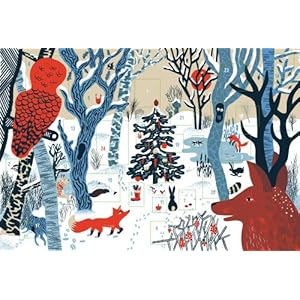
one of my favorite old drawings to adapt. At first, I was discouraged at how difficult it was to carve. But I realized that I was trying to carve too deeply; once I got the hang of it, it was great fun.


This material gives your cuts more of a traditional woodcut look, but it'll take some more practice for me. However, I may not return to the lino, because I'm in love with Speedball's "Speedy Carve", as you'll see below. (Why Speedball named their two materials so similarly is beyond me...I just call it "the pink stuff" now.)

Feeling pretty brave at this point, I decided to make try a two-color reduction print for my son's girlfriend's birthday, using a photo I'd taken of her beautiful Doberman, Guinness. Yes, I did an overlay on this one, not an original drawing, but it was a photo that I took myself. I decided not to create my own drawing, because I wanted to capture this specific dog, and we all know that we, as pet owners, know every little unique detail of our animals.

The Speedy-Carve is soft enough to cut easily, but retains its edges beautifully through multiple cleanings and printings. I experimented with different  papers, etc. My new fave is Arches 88...those prints turned out beautifully.


On a reduction print, you print the lightest color first, then cut away everything that remains that color to print the next color. Obviously, this creates a limited edition—there's no going back to that first layer! But if you used a little homemade jig like I did (see below), it makes registration a breeze. In fact, getting those two colors to align perfectly was my biggest fear, and they all came out lined up perfectly!


Here's my set-up: a piece of foamcore board with a hole cut the exact size of my block but not quite as thick. An L-shaped corner to register the paper against, 


and I made a "mask" out of heavy paper to quickly lay over the image after inking so that the stray inking marks would be covered up and wouldn't print. I learned that many experience printers prefer rubbing the back of the paper with a wooden spoon rather than a traditional baren. Easy and cheap!

I made about a dozen and got quite a few pretty nice prints out of those, but this was my best one, all framed up to send off!


I'll never give up my pencil drawing—in fact, I'm having a great time on a new piece at the moment—but there is definitely a lot more block printing in my future!

Tuesday, September 30, 2014

Golden Delicious

My neighbor's Golden Delicious apple tree is loaded with fruit, despite its height of less than five feet. They were quite greenish in color when picked, but have now ripened to their beautiful eponymous color. That monochromatic coloring doesn't lend itself to a drawing quite as dramatic as the Gala variety that I drew a while back, but I really loved the brown marking on the skin near the stem. Now that apple season is upon us, I'm hoping to fit in drawings of a few more varieties for this series:

Any favorites you'd like me to look for?

Monday, September 22, 2014

Happy First Day of Autumn!


A Trio of Buttercup Squash
Prismacolor colored pencil on Stonehenge paper
(click to enlarge)


I love going to the grocery store or farmer's market in the fall. The piles of pumpkins, brightly colored gourds and winter squash are irresistible to me—and such a variety of shapes and colors! Many of these buttercup squash (not to be confused with butternut squash) look like little lidded jars or pots. They're pretty cute, and after we try them for dinner tonight, I'll let you know how they taste!

Here are some shots of my "models" and work-in-progress:


After I do the sketch, I often scan it and print it out at different sizes, so that I can pick just the right size for the final drawing.

Greens are tricky to scan: You can see that the greens are much more accurate in the daylight photo than in the scans...hopefully the final scan at the top of the post shows the true colors, or at least close!


If you're not all squashed out, 
take a look at my drawing of my all-time favorite winter squash here.

Happy First Day of Autumn!

Wednesday, September 3, 2014

Horned Melon

Horned Melon, Cucumis metuliferus
Prismacolor colored pencils on Stonehenge paper

Have you seen these little spiky creatures at your grocery store? I saw some a few months ago, but didn't buy one as I had no time to draw it then. I've been scouting the produce section for them ever since, and—lo and behold—there they were last weekend! (I was going to get two, but that was before I realized they were about $6 apiece. Yikes.)

The horned melon is also known as the kiwano melon or the African horned melon, but I prefer its cute nicknames: hedged melon, blowfish melon, and jelly melon.


I drew the outside first and tried to see if the spikes fell in any kind of pattern or symmetry. (You know about my obsession with radial symmetry in nature.) But they seemed to be rather randomly arranged. So imagine my surprise when I cut it in half to draw the inside: My cut went through 3 spikes that were in an almost perfect equilateral triangle! In fact, the whole cross-section was shaped like a circle with 6 flattened faces. The cross-section looks very much like a cucumber (which is in the same family).


I am intrigued by fruits and vegetables, such as watermelon and kiwi, whose insides are in sharp contrast to their outerwear. This one pretty much wins the prize in that category, doesn't it?
(And, no I haven't tasted it...yet!)

Sunday, August 24, 2014

Three limes and a paper bag


Prismacolor colored pencil on Stonehenge paper ("Fawn", I think)
Approx. 5" x 6"

I bought some limes the other day to make this yummy melon gazpacho. As I was unpacking the groceries, they tumbled out of the bag and I thought they looked so beautiful—their bright, shiny green skins against the brown paper bag. (This drawing is a bit looser than some that I do...I had to get those limes juiced for the gazpacho at some point!)

But as I was drawing, I couldn't decide who was the star—the limes or the paper bag? Who doesn't enjoy the age-old classic challenge of drawing a crumpled paper bag? The limes won out, so I left the bag as just a few lines and shadows. (Now I'm in the mood to draw the bag all by itself and let it be the star this time.)

But the image above is a cropped version of the actual drawing. I've written posts about cropping before (here), but it's always an interesting challenge for me. I don't draw digitally, but I have come to rely on (or be dependent upon?) the Photoshop cropping tool. It's probably not a good thing that I know that I can, for all practical purposes, "compose" my drawing after-the-fact. I could play around with cropping for ages—I love being able to crop an image different ways for different uses, frames, etc.

Here's the actual full drawing:


And this one is "zoomed out" a bit further than the image at the top of the post:


And a square formatted one, for what it's worth:


What do you think? Is the cropping tool a crutch or just another wonderful tool to work with? Oh, and which of these cropped versions do you prefer?

Tuesday, August 12, 2014

Pretty Peach (and one that's a bit off)


Prismacolor colored pencils on Stonehenge paper
(click to enlarge)

I'll tell you right off the bat that I'm not all that happy with this one. Maybe it's because I realized, partway through the drawing, that the shape of the half on the left isn't quite right. I probably should have scrapped it then, and started over, but I worked on, hoping things would look okay as they were rendered.  But when it's wrong, it's wrong, and I think my heart just wasn't in this one after that point. It happens.  Although I did really have fun drawing the the peach pit!

Peach pits...I must detour a bit down Memory Lane. When I was a kid, Avon had this line of toiletries for girls called Pretty Peach. We had a few treasured items, but my hands-down favorite was this set of 3 soaps. (I just love things that have a little surprise inside when you open them.) To this day, I can't cut a peach in half without thinking of these:

Avon Pretty Peach Soap

(Isn't Google image search amazing? Found this on ebay.)


Okay, onward and upward to a better drawing next time. In the meantime, here are some WIP pics to distract you from my misshapen peach half. (Apologies for the uneven lighting; I just snapped these with my iphone at my desk rather than stopping to scan.) Have a peachy day.