Monday, December 2, 2013

Life drawing Meet-up: Week 2


Charcoal on newsprint, 15 minute pose

At Week 2 of my Life-drawing Meet-up, there was some discussion among the "regulars" of a book called, The Undressed Art: Why We Draw by Peter Steinhart. It sounds fascinating to me, especially after I came home and read this 2004 NY Times review. I reserved the book at the library and will keep you posted as I read it. 

What does compel us to draw, especially in today's digital world?

For me, it just feels like pure creativity, whether or not the end product is ever seen by another set of eyes. Drawing is, at the very least, wonderfully distracting and escapist, and there are days when it feels downright healing

Drawing is usually a solo, intimate activity, so it's interesting to me when a group draws together. In this group, we chat during breaks, but once the pose starts, all you hear is the scraping of charcoal and pencils on paper (what a great sound!) and the background music. Some people retreat to their earphones and iPods, others—like me—just stay unplugged, but we're all completely engrossed in drawing.

Our model was, once again, very good. I love that she wasn't the body type that is heralded in the media as being ideal; she had ample hips (much more fun to draw than thin ones, frankly) with a smaller torso. One of the other artists mentioned that she was reminiscent of someone in a work by Ingres (one of my favorite artists) which was so true! My proportions are a bit off, but here is the long pose for the day. Unlike last week, I bravely attempted drawing the model's face this time ...well, kinda sorta:

Charcoal and graphite on newsprint, 60 minute pose

So, tell me, why do you draw?

Saturday, November 23, 2013

Pomegranate


Our grocery stores are overflowing with pomegranates this week. The ones we get are grown here in California; they're so exotic and beautiful—and festive.

I'm hoping to do a more detailed drawing of one, with its beautiful jewel-like seeds, but with Thanksgiving approaching, I thought I'd better get a quickie drawing done just in case I run short on time. And since I've been interested in doing more "loose" drawings lately, my time crunch may be a good thing! (Drawings on black paper are really tricky to scan accurately, and even this photo that I took with my iPhone bumps up the color a bit too much, but it's closer to the original.)

If I do get a chance to do another drawing, I'll post it, but in the meantime,

Happy Thanksgiving!

Friday, November 22, 2013

Life drawing Meet-up: Week 1


As I mentioned in my last post; I've just started attending a weekly life-drawing group that I found through Meetup.com. It's been years since I've done any figure drawing, but back in college, I did quite a lot of it—and loved it. I was so excited to buy a big, fat pad of newsprint and get out my various charcoals, conte crayons and such.

Here's what I took:


And here's what I actually ended up using:


We had a wonderful model; her 1-minute warm-up poses were very dancer-like. When she took breaks during the hour-long pose, she marked her placement with little bits of tape, and was amazingly good at re-positioning herself. The pose at the top of this post was a 15-minute pose, and is my favorite of the day. (Drawings on 18 x 24 newsprint are a little bit challenging to photograph, but you get the idea...)

The 60+ minute pose (below) is a little overworked in places, and the chest area looks a bit too boyish, but I do like how the leg area turned out. Oh, and can you tell that my weakness is drawing faces? (Maybe I should be taking a portraiture class.) I feel that when I draw a so-so face on an otherwise acceptable drawing, the so-so face is all you notice. So I left this one blank (and, of course, it's all you notice!). Next week I'll practice shading in at least the basic planes of the facial structure.


My main goal for this first session (besides having fun) was to try and at least get the body proportions right, and I felt pretty good about achieving that, for the most part—and I definitely had fun. The ten 1-minute warm-up drawings (below) are such a great way to start; they really do help to sweep away those brain cobwebs and get focused.


The one thing I miss from a class with instruction is having a group critique. And you don't really get to see others' work unless you walk by during  break, etc. But those are very minor complaints. The "regulars" were very welcoming to the two of us that were newbies. There were six of us drawing, and  the cozy studio had lots of natural light—is there a better way to spend an autumn morning?

Monday, November 11, 2013

Ruts, nuts and guts


I'm in a rut.  It's not a bad rut, really—I still love spending hours on a detailed pencil drawing—but lately I've been yearning to return to a looser style.

Maybe it's because I recently unearthed a huge stash of my old drawings in my basement (photo below). As they are over thirty years old and have been through a basement flood incident or two, they're mostly browned and brittle and water-damaged. There are pads and pads of drawings, and while many should have been tossed long before now, there are still some drawings in there that I love and I found myself wondering: Could I still draw like that? Am I—thirty years and one Parkinson's diagnosis later—still capable of that loose style?

So, I grabbed a bowl of nuts and told myself that I could only spend 15 minutes or so on a sketch of them. To challenge myself further, I decided to draw with white pencil on black paper. I ended up with the little sketch above. It's fine, but it still felt way too tight to me.

I kept thinking about those old drawings, and the fact that many of them are from the numerous life drawing classes that I loved in college. So, I went online and found a weekly life drawing meetup in a local artist's studio—and signed up! My first session is this Thursday, and I'm a little nervous about drawing in front of strangers again, and drawing the human form for the first time in ages. When I worry that I'll totally bomb, I tell myself that my rusty skills won't return overnight, and "It's the process, not the product", but it's still going to take some guts to walk through that studio door.

I'll keep you posted. I'm trying to find a way to photograph and clean up some of the oldies, and if I'm really brave I may post some things from my Thursday session.

Or I may lose my nerve altogether and spend two days drawing an eggplant. Stay tuned.


Monday, November 4, 2013

Merry November

Prismacolor colored pencils on Strathmore Bristol Vellum


Well, at least I waited until after Halloween.

I adore autumn and Thanksgiving, truly I do. But my orange pencils are tired, and I want to get a jump on some holiday drawings. So, while I'm happily getting organized for Thanksgiving, over on my drawing table it's beginning to look a lot like Christmas.

Candy canes are classic beauties.  My family always eats them on our drive into the nearby Santa Cruz mountains when we cut down our Christmas tree. We hang them on our tree, as I did growing up. Let's face it—one just can't have too many candy canes around the house during the holiday season. 

I always buy (and draw) Bob's candy canes; they still come in a great old-fashioned looking box. Check out this site for Bob's products as well as some delicious candy cane history.

Yes, I'll definitely be celebrating Thanksgiving in a big way. But the next day, right there alongside the leftover turkey sandwiches, you might just find a candy cane or two.


Here are a few WIP shots; I used a lot of Prismacolor Verithin pencils on this piece; they're great for finer lines as well as burnishing. I was able to get just the shadow  that I wanted with a base layer of Indigo Blue topped off with Tuscan Red Verithin.


Wednesday, October 23, 2013

Turning over a new leaf

Prismacolor colored pencil, 6" x 6"

(Well, I'm not really turning over a new leaf, but calling my post "Rotating an Autumn Leaf" just didn't have the same ring to it.)

While I never draw digitally, I do rely on the computer for those non-invasive tweaks that can make or break the finished product. First up:  the rotation tool in Photoshop. The drawing  below shows how I originally envisioned the piece. But as I drew it, it began to look so static and lifeless to me. But with just a bit of rotating, it seemed to take on more movement and became a floating, falling leaf! 


I could even crop off the top a bit for this effect...I'm undecided on this one:


The next digital tools that came to my aid were my iPhone camera and iPad. (I know, this sounds like an Apple commercial.) I knew that the beautiful leaf was going to start drying out and losing its vibrancy before my drawing was done, so I clicked some pics on my phone. Thanks to the iCloud, (Sheesh, now I really sound like an Apple ad...) the pics popped up on my iPad and I could use it as my "model" instead!


So, what do you think? 

Do you like the "rotated" leaf better too?  

Tuesday, October 15, 2013

The never-ending gourd drawing

5" x 7" Prismacolor colored pencil on Strathmore Bristol Vellum


"Know when to stop." Well, I'm not sure that I stopped at the right time on this piece—some areas are a bit overdone, others could use more work—but sometimes you have had enough of one drawing, you know? I love pumpkins, squashes and gourds—their amazing colors and their lumpy, bumpy shapes are such fun to draw. (In fact, the turban squash that I drew a couple of years ago is still one of my favorite drawings.)  And they're very forgiving; who's going to know if you moved the bumps around a bit?

Here are some shots I took along the way. (Obviously, I'm not great at color-correcting scans and photos, and I find that orange tones are some of the trickiest!)


Monday, September 30, 2013

I love candy corn

3" x 3", Prismacolor colored pencil


Happy October! As a seasonal addition to my series of "botanical hearts", I give you the iconic candy of autumn in America—candy corn!

I love candy corn. I know, it's full of junky ingredients (mostly sugar) and I did find it humorous that this year's packages boast "Made with Real Honey" just above where it says "artificial flavors". But it's just so cute and nostalgic. It has certainly earned its iconic status—it was created in the 1880s by George Renninger of the Philadelphia-based Wunderle Candy Company. While I was researching that historical tidbit, I also learned that The National Confectioners Association estimates that 20 million pounds—just over 9,000 metric tons—of candy corn are sold annually. (I certainly did my part and consumed a bit while doing this little drawing.)

Just for fun, I thought I'd show you what my drawing board looks like when I'm testing colors, even for a simple little piece like this:


And here's another little WIP shot:


Happy October!

Note: If you'd like to see the other pieces in my Botanical Hearts series, the most recent one here has a link down toward the bottom of the post. One of these days I'll group them all together for easier viewing! 

Friday, September 20, 2013

Radicchio

I've been eyeing the radicchio at the market—isn't it beautiful? I love how the leaves nestle together so snugly. (Perfect for Illustration Friday's topic of "together" this week, in fact!)

I'm not a huge fan of radicchio's bitter taste when eaten raw. However, I was reading that, while Americans tend to use it mostly as a raw salad ingredient, Italians usually grill it or cook it in risotto, etc. So, I plan on cutting this baby into wedges, drizzling some olive oil onto it and throwing it onto the grill this weekend—we'll see!

It was a treat to use these colors for a change. Some of you may think that I should have drawn more of a pronounced outline at the white stems, but I like how the red leaves sort of emerge out of the white paper. What do you think?

Here's a WIP shot...I really love this stage; I'm always tempted to stop here!


I'll let you know how my grilled radicchio turns out; 
have a wonderful weekend and Happy First-Day-of-Autumn!

Tuesday, September 17, 2013

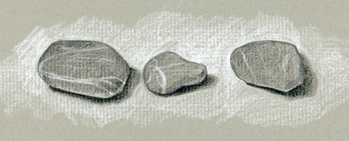
Three rocks


A quick sketch of
three little striped rocks
that I've had sitting on my desk.

Friday, September 13, 2013

Plums...and Friday the 13th

I remember reading a story about how Mad Men creator Matthew Weiner once had a bowl of apples removed from the set because they were too big—apples were smaller in the '60s. Well, he would have a hard time filming Betty Draper shopping at my Safeway; I recently noticed that the peaches are the size of softballs and even plums seem to have gotten much bigger. That may explain why I was attracted to these little Italian prune plums (or "Empress" plums) they had this week. I know, a little exotic for Safeway, right?

I've never attempted drawing fruit with lots of that dusky bloom on it, so I figured it was time. I browsed through a couple of my favorite colored pencil reference books and decided to give it a whirl...

I set up my little still life with my usual viewfinder approach.
(I wrote about it here if you're interested.)


Then I did my pencil sketch (below) on tracing paper and transferred it to my drawing paper.


I was actually most apprehensive about getting the plum flesh right, so I started there, in case I had to scrap the first attempt. I've seen photos of these plums with both green and golden flesh; I'm not sure if there are different varieties or if they're degrees of ripeness.


Hmmm...okay it'll do. Now onto the dark skins:


This shot is after layering two dark colors so far:


We interrupt this post for some Friday the 13th misfortune...

Yikes! Even though I'd done little swatches of how I thought the skins would work out, 
I made a terrible-horrible-no-good-very-bad mess of it.
There will be no photos or details here —trust me, it's a mess. 

I was feeling really frustrated about the whole thing as I went out to get my mail,
but I'm over it now. 

This helped:


So, how was your day?

Thursday, September 5, 2013

My green pencils need a rest.

"Brussels Sprouts"
Prismacolor colored pencils on Strathmore Bristol vellum, 3" x 11"


About a year ago, a close friend of mine gave her aunt a framed print of my drawing of an artichoke. Her aunt lives in a Northern California coastal area known for growing artichokes, pumpkins and Brussels sprouts, and kindly asked if I might draw those as well. You may recall that I finished the pumpkin, but the holidays intervened and when I finally had time, no Brussels sprouts (on the stalk) were to be found at the markets. (By the way, if you haven't eaten Brussels sprouts in a while, you should try them again. In recent years, some of the bitterness has been bred out of them—they're delicious!)

I almost never draw from reference photos; I just get a better result from real "models". But rather than put this drawing off any longer, I decided it had to be done. Now, if I were to draw using my own photos as reference, that's one thing, but this time I had to rely on stock photos I found online. The ones I ended up using had no photographer listed that I could request permission from and/or give credit, and they were all used extensively on  the internet as "generic" pics of Brussels sprouts. I also bought some loose fresh Brussels sprouts which were very helpful in achieving realistic colors and textures. (I posted some WIP shots in this previous post.) I'm happy with the end result, but can't help but feel a bit guilty about using those photos, even though they weren't "artistic" photographs per se.  How do you feel about that dilemma?

I've been a little negligent of my blog; I've been trying a new drug for my Parkinson's and had more than a few "foggy" days, but am feeling much better now. Looking back at my last few drawings, it's high time to draw something—anything!—that's not green.

Note: I just remembered that this week's topic on Illustration Friday is "lush". One order of lush Brussels sprouts coming right up!

Monday, August 5, 2013

The Tale of the Abandoned Watermelon

Prismacolor colored pencils on Strathmore Bristol, vellum, approx 3" x 3"

Oh, it started out simply enough: The beautiful patterns in the rinds of the small, seedless watermelons at the grocery store were calling my name.

When I got home, I set up my "model" to do the base drawing. Sometimes what appears to be a simple rounded shape can be one of the trickiest to draw. A "flexible curve" is an amazingly helpful tool. I've had this one for ages, since my designer days, but you can find a similar one wherever art/drafting supplies are sold. You just bend it around until you have the curve you want, and then lay it on your paper and use it as a template. Nifty!


Then I did some not-so-pretty swatches to figure out how to achieve the colors in the rind. As you probably know, with colored pencils, it's all about layering. I often pull out some reference books for ideas. Three of my favorites for this are Botanical Portraits with Colored Pencils by Ann Swan, Painting Light with Colored Pencil by Cecile Baird, and Colored Pencil Solution Book by Janie Gildow.                   .


One tip that I learned ages ago (probably from one of those three books) is that a very light layer of Canary Yellow under the greens of a botanical piece will add a lot of light and life.


Well, at this point, I got overwhelmed. I was trying to do a life-sized drawing, and even though it was a very small melon, it seemed a bit daunting (and more than a bit boring) to fill in the whole thing. I thought, should I cut it in half to expose the center? Nah...the red center always gets all of the attention. I decided to sleep on it.

The next day, it dawned on me: my little botanical/nature heart series! A while back I started these as a way to explore textures in a small piece—almost like doing swatches. In the end, I had so much fun working on this, and I know that if I'd tried to fill in that bigger watermelon piece, I'd have gone a little nutso. I just don't have that kind of patience. Here's a little overview of the process:

Canary Yellow and Tuscan Red

adding Indigo Blue
Olive Green, Dark Green...and  a few other greens!

If you'd like to see the other hearts in this series, start here.

Happy watermelon-eating August to you! 

P.S. The last of my travel posts will be up shortly.
.

Tuesday, July 30, 2013

Beatrix Potter's Lake District


© National Trust

Don't worry, I don't intend to recap my whole vacation on my blog, but since so many of you are artists and book lovers (especially children's books), I'm sharing some things related to those passions. 

Here we go! After Oxford (the previous post), we hit the road to head up to the Lake District. (Actually, we toured Blenheim Palace and Warwick Castle, but I can only bore you with share so much here.) I was still a bit nervous about being a passenger on the left side of the car, but sights like this lightened things up...

click to enlarge all photos...

...as did a stop at a service center—so much fun to peruse a British candy aisle.


Arriving in lovely Windermere, we drove right onto the ferry to get to Near and Far Sawrey, Beatrix Potter's stomping grounds. She was actually quite instrumental in preserving much of the land that is now part of the Lake District National Park—just another reason to love her! We stayed in a beautiful inn called Ees Wyke Country House, and the scenery was breathtaking. Miss Potter actually stayed here on holiday:
"It was taken for granted that the two young Potters would continue to accompany their parents on holiday even when they were grown up, and Beatrix was nearly thirty when they all went to Sawrey for the first time in 1896. The property that Rupert Potter took that year on the edge of the village was a large country house, Lakefield, which by their return in 1900 had been renamed Eeswyke or 'house on the shore'. From the pretty garden there was the magnificent view over Esthwaite Water to the hills of Coniston beyond, and behind the attractive whitewashed house was a bustling farm with sheep and cows and pigs. Beatrix took her pet rabbit, Peter, with her, the coachman took his cat, and during their stay Beatrix and Bertram drew and painted, went for long walks on the fells or drove round the district in the pony and trap."
—from the National Trust book, Beatrix Potter and Hill Top

The owners of the inn have two friendly Old English sheepdogs, Harry and Teddy, which made the place even more charming. Sitting outside, you could hear the sheep on the hillside...it was idyllic, to be sure.


A little weary of braving the driving on very narrow country roads, the next day we decided to skip the trip to the Pencil Museum in Keswick, and relax and enjoy this area. Sawrey and Hawkshead are full of Potter lore, and none of it is overly tourist-y, amazingly enough.

It was just a short walk up the road from the inn to visit Hill Top House, Beatrix Potter's home. There's hardly a wooden or metal fence to be found anywhere in this area. Just miles and miles of these gorgeous stone walls:


We passed this little inn, the Tower Bank Arms...


which can be seen in this illustration from The Tale of Jemima Puddleduck:

©Frederick Warne & Co.
We arrived at Hill Top House, knowing that the house was closed on Fridays (as I mentioned in this previous post), but the grounds and gardens were open. It turned out to be a great time to visit, since there were fewer people.  It was a beautiful day, and so many of her stories and illustrations went through my head as we wandered through this charming place. You can see glimpses of the house and garden in many of her illustrations:


both illustrations from The Tale of Tom Kitten 
©Frederick Warne & Co.

from The Tale of Jemima Puddleduck
©Frederick Warne & Co.

We then drove into nearby Hawkshead, where her husband's former office has been converted to a museum and gallery by the National Trust. Seeing her original artwork was nothing short of amazing. I didn't take pictures in there, but I did manage to take a few of our lunch that followed!


Sigh...we could have stayed for weeks in the magnificent Lake District. But, we had a train to catch...

The last "travel post" will follow soon: a quick recap of Paris and London. I know, no one needs to see another photo of someone standing in front of the Eiffel Tower. I'll keep it blogging/art/book related, I promise!

Note: Just after I published this post, I saw a great piece on today's Buzzfeed: 11 Reasons Beatrix Potter was the Most Charming Pen Pal Ever. It's wonderful...check it out here.