Showing posts with label flowers. Show all posts

Tuesday, April 26, 2016

Sunflower Seeds in Snazzy Striped Shells...And Ai WeiWei

14" x 14", Prismacolor colored pencil on Strathmore Vellum Bristol

I was preparing to plant some Mammoth sunflower seeds, but became distracted admiring their snazzy striped shells. Next thing I knew, I was drawing, not planting. 

While researching sunflower seeds for some fun facts to include here–lest anyone think me odd for drawing a few sunflower seeds–I ran across the phenomenal installation at the Tate in London by the Chinese artist Ai Weiwei in 2010. He and his artisans made and hand-painted millions of ceramic sunflower seeds. I can't even begin to explain it well; you must check it out here. (Suddenly, I felt a bit less odd for drawing nine of them.). 


Let's hope that the squirrels and birds allow these seeds to grow into big, cheerful sunflower faces in my summer garden!

Tuesday, May 27, 2014

Orchids: Beautiful symmetry

Prismacolor colored pencils on Stonehenge paper
3.5" x 4" (2x actual size of bloom)

I have an obsession with symmetry, especially radial symmetry, in nature. (Click here for some of my other posts on that subject.) So, while orchids, arranged along their graceful stem, make a lovely artistic composition, I like to examine their beautiful symmetrical structure. When my friend gave me this planter as a gift recently, I immediately said, "I'll have to draw these!"


I spent quite a while looking at online photos of the thousands of types of orchids; some of them are truly spectacular. This one (as close as I could tell) is a miniature hybrid phalaenopsis sogo gotris. As you can see in the photos, it's smaller than the other one in the pot; which I plan to draw as well.


The petals looked creamy to me in the light at my drawing table, but  they look a bit more green in these photos; I might have to go back in and green them up a bit.

Orchid blooms look an awful lot like faces, don't they? Now, if I can just keep these little beauties alive...!

Friday, January 3, 2014

Hip-happy New Year!


Sometimes it pays off to be lazy. Because I didn't keep up with the chore of dead-heading my rose bushes, I now have an abundance of beautiful rose hips. It seems that many people today are obsessed with having gardens that are neatly manicured; leaves raked up as soon as they fall (or worse yet, blown away with a loud gas-powered blower). As for me, I like my garden a bit on the wild side. (Too many readings of The Secret Garden can lead to this particular form of botanical laziness.) I suppose that in bygone days, people had more important things to do than to trim the dead roses, or perhaps they simply knew what treasures rose hips could be! I'd heard of rosehip tea and jam, but found all sorts of interesting facts when I googled "rose hips". My favorite is that chickens seem to love them and, as they're laden with Vitamin C, they're a healthy snack for them—and guinea pigs, too! I'm going to try some out on my hen Charlotte this afternoon.

I am behind in my postings from my weekly figure drawing meet-up; most of the drawings are too big for my scanner, so it takes me a bit longer to take pics. I'll try and post some this weekend, and then I'll aim to post some each Friday after the meet-up on Thursday. I noticed that one figure drawing blog that I was viewing had a warning of explicit material. I didn't even think about that—would you think that it's necessary? Sheesh, in a world where we have to be bombarded with images of a twerking Miley Cyrus, I think we can deal with a charcoal nude drawing or two.

For the new year, I'm trying out a new banner on my blog; the old one has been up there since I started blogging. In case you've forgotten, it used to look like this:

I'm still working on some other ideas; I'm thinking I might try to create four different seasonal ones or something. I'd love to have your feedback. And, since one of my resolutions is to get back to making regular blog visits, I hope to see what you're up to soon!

Happy New Year!

Wednesday, May 8, 2013

A flower for Penelope


Prismacolor colored pencil and graphite on Strathmore Toned Tan sketch paper
(click to enlarge)

This week's topic on Illustration Friday is "Tribute", in honor of its founder, Penelope Dullaghan, who has recently moved on to pursue other projects. Before I launch into my own tribute to Penelope and IF, I'll explain my little sketch:

When my husband and I moved to California many years ago, we were invited to dinner at the home of a family friend. Along one side of their house, they had a profusion of different varieties of fuchsia on display, and I fell in love. I haven't had any in my own garden for years, so when we recently replanted a flower bed, we decided to add some fuchsias. At the nursery, I was instantly drawn in by their names. I love it when plants are named as a tribute to a famous person. I chose two, almost as much for their names as for their beauty. One is Fuchsia "Winston Churchill" (which I love because I'm an admitted Anglophile) and the other is the one I've sketched here. With its red "hat" and white "beard", how could I resist Fuchsia "Santa Claus"?! Such a lively little blossom; the whole time I was sketching it, I kept thinking of the Flower Fairy illustrations by Cicely Mary Barker. You can see her charming Fuchsia fairy here.

Now for my tribute to Penelope Dullaghan:

One of the reasons that I started blogging a few years ago was so that I could participate in Illustration Friday. For a long time, I was a very consistent contributor—I rarely missed a week! Early on, one of my drawings was even selected to be IF's "Pick of the Week" which gave me lots of exposure and encouragement. But most importantly, I got to know many fellow artists that also participated  in IF regularly. (Once I realized that if I commented on a drawing, that person often commented back, the communication floodgates were opened!) I consider a number of these people to be friends: I still visit their blogs regularly, chat with some on Facebook, and a few of us even check up on one another when we haven't posted in a while. For these reasons, I send my heartfelt thanks to Penelope for her devotion to this website that gave rise to such a wonderful supportive community.

Having said that, my recent IF entries have been few and far between. I've had a busy spring and wasn't at my drawing board as much as I'd have liked, but things are a bit quieter now, and I'm hoping to spend more time doing these quicker sketches when I'm not working on a more detailed piece. I will also be visiting blogs, making some new friends, and checking up on the old ones! So, in the spirit of the IF community that Penelope nurtured, feel free to leave a comment and say hello!


Monday, November 5, 2012

Notecards II

Yikes... it's been a month since I've posted! I've been busy with a couple of projects that I'll share with you shortly, but in the meantime, I thought I'd show you a set of cards that I put together for a friend's birthday. (Apologies for the uneven lighting in this shot; I was rushing around, as usual. But not a bad shot for an iPhone...) I made a different set a while back (you can see that post, with details about the supplies that I used, here). However, instead of spray mount, I used a wonderful little Tombow adhesive this time...so easy! And for this set, I used Paper Source's "Cement" for the A7 notecards and envelopes and "Lake" for the box.

Here's the label that is on the box bottom...I completely forgot to photograph the finished box from the top, but it also had a vellum band like the first set. This time I used one of the flowers from the "Yesterday-Today-Tomorrow" card as the sticker.

I keep thinking that I might someday get organized enough to put cards and prints in an Etsy shop, but I'm not sure that it'd be worth the time and effort. I'd love to hear from those of you that are Etsy sellers...has your experience been positive?

Monday, April 2, 2012

CP Magazine!


Last month, I received an email, out-of-the-blue, from the amazing Ann Kullberg. (If you are into colored pencil art, then you're no doubt familiar with Ann. She has a fabulous website devoted to colored pencil art, has published a number of books, and even publishes CP Magazine.) Ann was emailing to ask if she could use my delphinium drawing in the April issue of her magazine, which would feature botanical art!  I was thrilled, of course, but quite humbled. Would my little drawing, created to illustrate "gesture" for Illustration Friday, hold its own among pieces by well-known artists? Well, I've just downloaded the digital version of the issue, and I'm happy that Ann chose this piece—it's not your "textbook" photo-realistic botanical art, so I think it helps to illustrate the range of styles in botanical drawings.

So, check out the April issue of CP Magazine—it features the amazing Ann Swan (my idol), a fascinating step-by-step by the talented Susan Jones (her work is exquisite) and includes one of my all-time favorite botanical pieces, that astounding Savoy cabbage drawn by Janie Pirie. Thank you so much for including my little bouquet, Ann!!

Tuesday, March 27, 2012

A toast to Google image search!

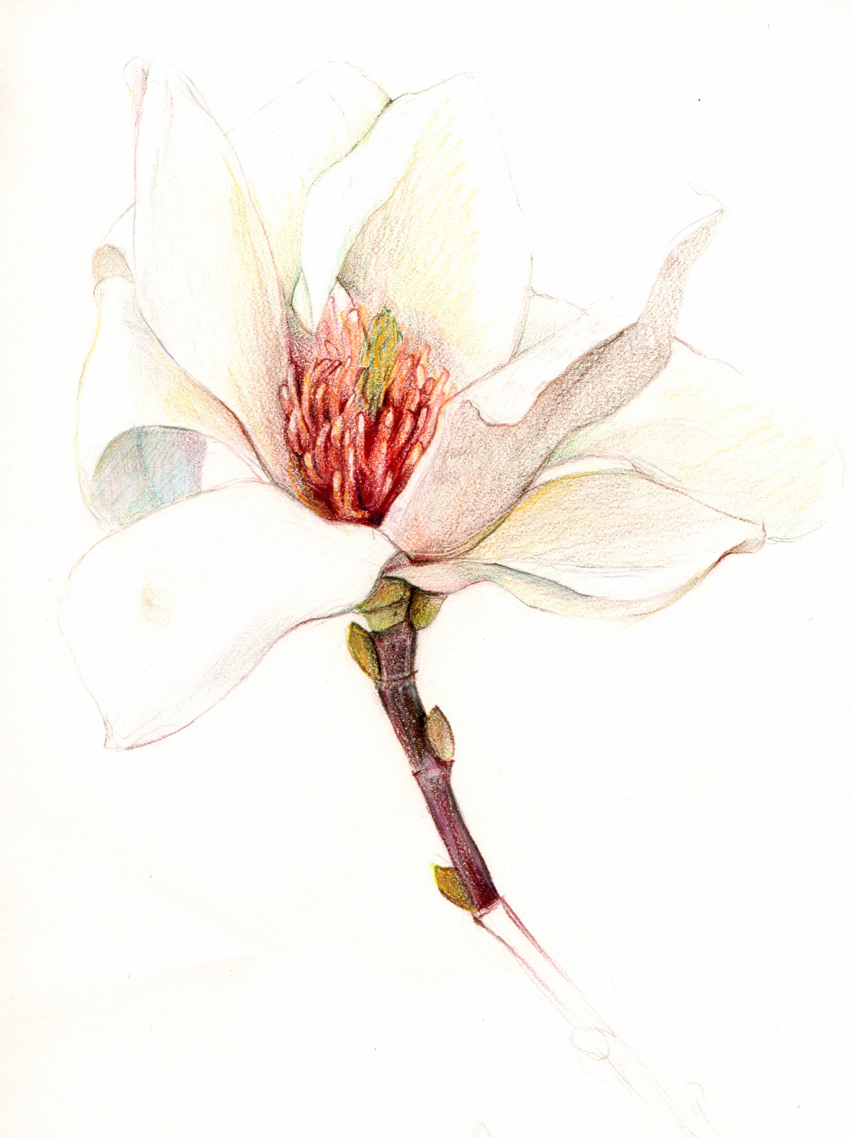
I'm a bit obsessed with Google image search. It all started about a year ago when I received an email from a graphic designer in NYC. He had a client—a very small Napa Valley winery called Gofessel Vineyards—that was looking for an illustration of a magnolia to use on a wine label. They'd done an online image search, found my magnolia drawing, and wanted to know if I'd be interested in licensing it. I was thrilled, of course! We worked out the details, and I emailed the file off to him. I was beginning to appreciate the benefits of online image searching.

Months later, I realized that I hadn't heard anything further. I checked in with the designer and learned that the wine was actually bottled, labelled and available for sale. It was great fun to order a case of these babies for Christmas gifts.

Well, my love affair with Google image search continued when I read that it's a great way to check and see if anyone has used one of your images without permission. Really?! You just go to the Google search site, click on "images" and there's a little camera icon that appears in the search box. Clicking on it allows you to upload any of your images, and then it'll find matches on the internet. I tried my magnolia drawing as a test case, and lo and behold, it immediately found my blog and the aforementioned winery website!

But the really fun part—if you're as easily amused as I am—is that it will show you  images that it considers "visually similar" to yours. For instance, here's what popped up when I entered my red onion drawing (seen below as the first image):

or how about when I entered my purple beans?:

Isn't that a hoot?

But all silliness aside, Google does seem to provide an amazingly in-depth image search. I did find that a small non-profit used my drawing of a Starbucks cup on a one-time online invitation to a coffee hour meeting. Of course, I'd never care about something like that, but if your images are being used commercially and/or extensively in ways for which you should be compensated, shouldn't you know about it?

So if you have some time, do a little sleuthing via Google images...but I warn you, it's addicting!

Tuesday, March 6, 2012

Birthday Bouquet

Prismacolor colored pencils on Strathmore Bristol, vellum finish

Back on Washington's birthday, I mentioned a birthday-related piece I've been working on. So, here you go: this is a drawing that I did for my sister's birthday. I took the birth flower for the month of her birthday, and combined it with the birth flower for the month of her daughter's birthday, for a little "family bouquet". And since her three cats are an important part of her family, I tucked in three sprigs of catmint in for good measure, and tied it all up with a ribbon bearing their last name.

I love the symbolism of flowers. Besides birth month flowers, there's a whole tradition of floral meanings. Floriography, or communicating through the coded language of flowers, was especially popular in the Victorian era—I find it fascinating. I recently read a really wonderful novel by Vanessa Diffenbaugh called The Language of Flowers. It's a contemporary story, but a lot of the plot revolves around flowers and their traditional symbolism. (It's also set in the San Francisco Bay area, where I live, which made it doubly interesting to me.)

I'm planning on doing one of these bouquets for my own immediate family; it's a concept that I think would work well as a customized gift for weddings and births as well, don't you think?

Wednesday, January 4, 2012

A new leaf


Two of my New Year's resolutions at work here: (1) Draw something every day and (2) Post more often. So, even though this is a rather humble drawing, I'm sharing it.

I adore cyclamen, with their heart-shaped leaves. The white of the flowers is the whitest, freshest white there is, and the way they bloom sort of upside-down and inside-out makes me smile. In fact, this was just a drawing to sort of "get acquainted" with the shapes and structure; I'm thinking that I could have some fun doing some close-ups of the blooms and/or some detailed color pieces.

 It took about an hour, including the time I had to go outside and calm my chickens down. (The squirrels find it amusing to sit in the trees above them and shower them with leaves. Clearly, squirrels rank a bit higher than chickens on the intelligence chart.)

I'm never quite happy with how pencil sketches scan. I tried taking a shot of it with my camera, but my photography needs work (another resolution). If you scan pencil and colored pencil artwork and feel like sharing what scanner you've had success with, I'd love to hear from you!

Wednesday, July 20, 2011

Illustration Friday: Gesture


Giving flowers is a gesture of caring—whether it's romantic love, remembrance, or just an attempt to bring a little sunshine into someone's day.  Flowers from a florist can be dandy, but some of my favorites have been the handfuls of blossoms plucked from the backyard and proudly presented to me by one of my kids.

This time, I did the plucking—these delphiniums (or larkspur, a name I like better) are from a pot on my front porch. They're the July birth flower, and are symbolic of an open heart, according to the Victorians. As any fan of the Brontës or Jane Austen knows, the Victorians felt that it was improper to express strong emotions verbally, which led to the popularity of a whole coded language of flowers, also known as floriographyWhile a bellflower meant "I'm thinking of you", a yellow carnation meant "You disappoint me".
So polite, so proper.

Maybe it's the warm weather, but my last three posts have all been drawings in very cool colors—have you noticed? That's unusual for me: usually those blue and violet pencils are languishing in their jars while the warm colors (and the ever-present greens) are front and center. I also played around with a something I've seen in traditional botanical illustration - combining color with black-and-white drawing. The "plant hunters" of the Victorian era would sometimes color only part of their field drawing...just enough to accurately record the colors and get back in time for tea. So polite, so proper...sigh.

If you're into botanical illustration even the slightest little bit, you must check out this blog from the exhibit at the NY Botanical Garden before it wraps up at the end of this month. There are some really spectacular pieces!

Note to visitors from Illustration Friday: Thanks for stopping by in spite of my messed-up blurry thumbnail on the link viewer...that's what happens when I try to post late at night...

Wednesday, June 22, 2011

Illustration Friday: Launch


An alien spacecraft preparing to launch?

Nope, it's a passion flower, easily the most exotic plant in my yard, and certainly one of my favorites. And "launch" it does, believe me—I'm constantly hacking back the vines and ripping out new shoots that spring up all over my garden. I have two slightly different varieties in my yard, and both grow like weeds. Better than weeds. It's indestructible. You can't kill it. Hmmm, maybe it is an alien life form after all...

As one might expect from a bloom this intriguing, the passion flower, or passiflora, has quite a bit of lore and legend attached to it. Its name comes from the Passion of Christ, as Spanish missionaries saw all kinds of symbolism in it, which you can read about here . In cultures where Catholicism isn't as widespread, it is sometimes called the clock flower (although there are 10 not 12 petals) or the Maypop—its hollow fruit pops open when you squeeze it.

While fascinating to look at, it's a bit of a challenge to draw. The flower doesn't last long, and closes when the light fades. I intend to try this one again, and hope to show the beautiful vines and leaves, the different stages of the bloom, and the fruit. In the meantime, check out some of these amazing photos...rather bizarre, but so beautiful!

Tuesday, May 31, 2011

Waiting for summer

Protea "Pink Ice"
11" x 14" Prismacolor colored pencil on Strathmore Bristol

Our California summer is slow in arriving this year, but while I was finishing this drawing, I could pretend that I was enjoying a warm, dry African climate. This is the "other" protea that I mentioned in my last post. I continue to be fascinated by the botanical world: drawing the outer part of this flower was almost identical to drawing an artichoke or a pinecone.

Speaking of Africa, I have to tell you about my new favorite children's book, Me...Jane by Patrick McDonnell. (See it over there on my sidebar?) If you're a fan of children's books, you'll know the feeling of paging through a picture book that is so wonderful that it chokes you up a bit. This book is a look at the childhood of Jane Goodall, and speaks eloquently to children about making their dreams come true. Jane Goodall has long been a hero of mine—many moons ago, I started out as a biology major in college, with visions of romping through the wild, notebook in hand, à la Jane. After a few tedious late nights in the lab, mating fruit flies, I switched to Art & Design, my other passion. (Interestingly, my son is now a field biologist, romping through the woods, notebook in hand, à la Jane.) Patrick McDonnell, best-known for his comic strip, "MUTTS", has created a masterpiece. Looking a bit like a field journal, this book treats you to his charming, sensitive illustrations enhanced by gorgeous vintage engravings behind the text, as well as some of Jane's own childhood sketches...and then there's that goosebump-inducing photo on the last page. Do yourself a favor, and get a copy of this one. Or better yet, sit down and read it with a child that you love...and get goosebumps together.

Note: I'm trying to tweak the type that I'm using for these posts. I was using a smaller type for the past couple of weeks, but it suddenly looked too small to me today. I'd appreciate any feedback as to which is more legible to you, or, being the indecisive type, I may be toggling back and forth between the two forever...UPDATE: Thanks for the feedback; I'm switching back to this larger type...for now!

Tuesday, April 19, 2011

Illustration Friday: Journey


This week's Illustration Friday word is "journey", so I give you...a shrub. 

This is Brunfelsia pauciflora, but I prefer its evocative common name,  
Yesterday-Today-and-Tomorrow.

Walking through our neighborhood, a friend and I used to pass one of these gorgeous plants, and we'd always comment on how much we liked it.  Once I finally learned its name, I liked it even more.  The name is derived from the fact that the blossoms start out a bright violet, fade to a beautiful lavender about a day later, and end up almost white.  Its poetic name makes it a perfect gift to celebrate a birthday, a new baby, any landmark along life's journey.
  "Learn from yesterday, live for today, hope for tomorrow."
—Albert Einstein

Note: For some reason, my jpg images are looking fuzzy once they're placed into this post. (Click on the drawing if you'd like to see how it should look.)  If anyone has advice for me, I'd love to hear from you!

My Yesterday-Today-and-Tomorrow plant

Tuesday, April 5, 2011

Illustration Friday: Duet


I normally don't like to draw things in twos; odd numbers are usually much more pleasing to my eye.  So, when I saw this week's topic on Illustration Friday, "duet", I was in a quandry.  Of course, some things do make sense in pairs: shoes, dice, even birds. (There are, in fact, a number of gorgeous pairs of birds in this week's group - well done, everyone!)  Then, I was out in my garden and saw that my calla lily plants had decided to solve my problem: two blooms were showing their faces, just asking to be my models.

Most flowers do look best in odd-numbered groupings; the Japanese practice of ikebana certainly adheres to that tradition.  Perhaps it's because they're oddly asymmetrical, unlike most flowers, but I think two calla lilies look just right.  (After all, if it's good enough for Georgia O'Keefe, who am I to quibble?)

And if you're in the mood for a musical duet, there's none better than the father-daughter YouTube sensations, Jorge and Alexa Narvaez.  If you haven't seen them, take a few minutes to watch...I promise you'll be glad you did!

Sunday, March 20, 2011

Illustration Friday: Cultivate

"The garden is a ground plot
for the mind."
 
—Thomas Hill,  The Gardener's Labyrinth, 1577

Several days in a row of spring rains are keeping me from putting in my vegetable beds as I'd planned, but the Illustration Friday topic of "cultivate" has me thinking of gardening nonetheless. (I found that wonderful quote in a book that I love to page through when I can't be outside in a real garden: The Garden of Reading.)

This magnolia drawing (also part of my page banner) was drawn at a workshop that I attended quite a few years ago at Filoli, an historic estate with beautiful gardens about thirty minutes north of where I live.  (The mansion was used for the exterior shots in the tv show "Dynasty", once upon a time.)  Filoli has a wonderful botanical drawing program, but the classes are quite pricey—however, the two-day workshops are a little more affordable.  The class description said that all mediums were welcome, but I was the only person not using watercolors, which I found a little intimidating.  I never completed the drawing (I'm not sure I even went back for the second day, come to think of it), but I kind of  like the fact that the image is sort of blossoming out of the white paper.

At that time, I did very little drawing for pleasure.  But in the following years, I would occasionally steal a peek at this piece, as if to remind myself that, even though I didn't have the time or inclination to cultivate it, the artistic side of me was lying dormant, ready to emerge when the time was right.

By the way, two of my favorite farmers/gardeners are back in my life this week:  The Fabulous Beekman Boys will be back for Season Two on Planet Green on Tuesday, March 22!  (There is also a Season One marathon being shown today, at this very moment.)  You may remember that I blogged about and drew my Beekman 1802 goat milk soaps here and here, back in January, and even got a comment from the guys themselves.  Love them, love the show, love Josh's book, love their goats...you get the idea.

Sunday, February 6, 2011

Winter, interrupted

 I've been trying to get started on my "reverse" drawing for Illustration Friday, but the weather in the Santa Clara Valley has been too distractingly warm and sunny.  This valley was once called "The Valley of the Heart's Delight"...isn't that a wonderful name? (Much better than "Silicon Valley" which is what most people call it these days.) When I moved here in 1979, a person driving through San Jose would pass busy, viable orchards on many major avenues.  Today, most are gone, within the city itself, but we still reap the benefits of the temperate valley climate.

Every year, when the fruit trees and shrubs start to flower, I admire my neighbor's flowering quince and vow to plant one in my yard.  Well, that still hasn't happened, but she always urges me to come over and cut as much as I like.  I decided not to include the blossoms in this drawing, because I just love the plump buds, sitting there waiting to explode.  When I started the drawing, I quickly rendered the petal areas first, and I'm awfully glad that I did - when I returned to finish it the next day, they were almost all in full bloom! The subtle shadows don't show up very well in this scan; this drawing is definitely one that might photograph better than it scans. I'll let you know when I get to playing around with that.  Now, back to thinking about "reverse"...