Wednesday, February 27, 2013

Bell peppers with spumoni gelato


No, that's not a photo-realistic colored pencil drawing. It's a photo of the spumoni gelato that I just served myself as consolation for messing up a drawing that I've been working on yesterday and today. I suppose it's important to share failures as well as successes, so here's my sordid little tale:

It all started out well enough. Not finding inspiration around the house, I headed over to my neighborhood Safeway to peruse the produce aisle. It never disappoints. Here are my purchases/models-to-be:


The beautiful bright orange bell pepper (not as red as it looks in these photos) was calling my name, so I set it up on my desk,

and chose my pencils (using my indispensable swatch cards).


My plan was to draw the outside and then, next to it, a cross-section showing the inside. I even remembered to take some work-in-progress scans:


I was really happy with how the top and left side of the pepper were shaping up. Instead of going for the blended, burnished look, I was trying to keep that softer colored-pencil texture while conveying a smooth shiny surface. (Does that make sense?) Working on the shaded right side, I was trying to layer the colors without reaching that saturation point where the paper won't take any more of the wax-based Prismacolor pencils. Now, this scan is being kind, but if you click and look closely, you'll see that, all of a sudden, the darker colors shading the right side were coming out all blotchy and overworked looking. (Trust me, the original is far worse than this scan.). I tried burnishing, smoothing, and in desperation, used my blender pen which caught a stray crumb of pencil from somewhere and made a dark streak on the upper right of the pepper. Soooo, I tried to hide that "scar"...the whole thing was like trying to fix your bangs when you cut them crookedly. Ugh.


Now, maybe I could fix it digitally, but do I really want to spend any more time on a drawing that will never be the way I want it to be? No. I'll chalk it up to a lesson learned...and enjoy my ice cream while I ponder doing some "looser" drawings instead of these time-consuming ones. Food for thought...literally!

What do you do when a piece goes awry? Do you live with it? Toss it? Eat gelato?

Wednesday, February 13, 2013

Two Valentines


I pulled out this oldie for Valentine's Day—a little drawing that I did a couple of years ago for Illustration Friday. (You can read the original post here.) And, for those of you who prefer the sweet and traditional, here's my little sketch of conversation hearts from last year. (It was also for Illustration Friday; the original post is here.)


I also do a little series of "botanical hearts"
—you can see what I have done so far here.

Have a wonderful Valentine's Day!

Friday, January 25, 2013

Wings


" I have made a great mistake. I have wasted my life with mineralogy, 
which has led to nothing. Had I devoted myself to birds, their life and 
plumage, I might have produced something worth doing." 

 —John Ruskin

I was excited to read that this week's Illustration Friday topic is "wings", as I have just finished this drawing of  spotted owl and peregrine falcon feathers. It was a Christmas present for my son; I know, I know, it's January, but he has just returned from three months in New Zealand, so our celebration was postponed a bit.

As I've told you in a previous posts here and here, he's a field biologist currently working with the California Condor group at nearby Pinnacles National Monument. (Pinnacles was recently upgraded to national park status!) Before that, he worked with a spotted owl research project up in the Sierra. With a few months off between stints at Pinnacles, he took a working vacation to New Zealand—backpacking, photographing, and working on a local falcon project.

My son is one of those lucky adults who has a job that grew from a childhood fascination. As a little boy, he would count hawks to pass the time on our summer drives to Lake Tahoe, and requested that his 7th birthday cake be decorated with a peregrine falcon. I was able to unearth this photo (terribly out-of-focus, I'm afraid) to document my culinary creation. Twenty years later, I hope that he'll enjoy this drawing just as much.


Here are a few WIP shots...I always enjoy seeing them in posts; I hope you do, too!


Tuesday, January 15, 2013

Calendars

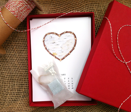
Before we get too far into 2013, I want to share the little calendars that I made for this year. They started out as Christmas gifts for my book club, but I was pretty happy with how they turned out and made a few more for friends and family members as well.  Early in the year, I'd thought about doing more of my "botanical hearts" to make one for each month, but that just didn't happen. As it turned out, I had fun selecting from among my drawings to find one that suited each month (sorry, my photos are a tad askew):


I love packaging, so I placed the pages in a festive red box mailer from Paper Source. The little glassine envelope holds a stand and a hanging clip. The stand is a little place card holder that I found at Crate and Barrel. Because the paper that I used was a little too thin to stand upright on its own, I cut a piece of heavy white card stock slightly smaller than the 5 x 7 calendar pages; it can be placed in the stand behind the page.

As an option to the stand, I included a little bulldog clip so that the whole year can be tacked up on a bulletin board. And since the pages are 5 x 7, they could also be displayed in a simple photo frame.

I got a lot of  nice "You should sell these!" remarks, which gave me etsy-on-the-brain again, but honestly, I'm still not convinced that I could make any profit in that scenario. Maybe I'll stop blathering on about it and just try it someday. Then again, I ran across this great piece yesterday on  the fabulous website, Brain Pickings. In a letter to his teenage son back in 1927, writer Sherwood Anderson wrote this wonderful sentence:

“The object of art is not to make salable pictures. It is to save yourself.”

Amen.

Friday, January 4, 2013

Nuts Once More


Prismacolor colored pencil on Strathmore charcoal paper, "Golden Brown"

I posted a work-in-progress shot of this piece back before Thanksgiving, and just got a chance to finish it.  (You can read that first post here.) Thankfully, nuts don't wilt or shrivel up like some botanical models, they just waited patiently stuck to a piece of foam core board until they got their call-back:


I was originally going to do at least one more row of nuts, but the square format of these three seemed finished to me. This was such fun—almost monochromatic, it was a great practice in seeing and drawing textures. And I love using toned paper, but it's a pain to scan, as it loses its texture. I'm going to take some camera shots and I'll let you know if it's an improvement.

On another topic, I'm thinking of re-doing my blog banner—all of the images in this one are at least two years old. I like really simple banners, and yet, I want a first-time visitor to quickly get a feel for what I do. Maybe I can come up with a few ideas and get some feedback from all of you! How about you...exactly what do you like a banner to convey?